Digital Media Productions
Website design and Digital Content Creation
"gyo" is my project page about the world we live in. It will include news about music and fashion and its changes over the years.
This is my first attempt at creating a loading page for the website. My goal was to make it look straightforward and basic, with a seamless transition to the main landing "home" page.
The loading page is made up from a simple white background, with a black gradient coming from the bottom upwards. The middle of the page contains the word "gyo" which is the pages name, which gives an idea to the visitor that the websites name is "gyo"
The website's loading page is monochrome.
Below the "gyo" there is a simple loading wheel which is made from a dozen faded lines which spin as the website loads.

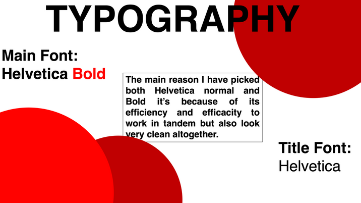
Helvetica Bold was the font I selected due to how it makes the text extremely easy for people with vision impairments to read.
Creating the homepage was quite a challenge as I researched a few websites that look like what I invisioned my website to look like once I create it.
To first create the homepage I needed to look at what colors I will display on the website, as I have mentioned I have looked at other websites and quickly came to an epiphany.

As you may notice looking at the picked websites, they all have blocks of color/shade. Also a very small amount of use of color in their logos/website.
After seeing this I have decided to create a multitude of color swatches and try create a theme for the website, one that would be easy to read for everyone but also one that can be remembered and iconic.

Here I have looked for two copyright free images I can use to inspire my color theme for the website. I have picked Abstract mixed red color painting by FreePik and Abstract Blue by Google. I have then created color swatches for each of them to see exactly all of the colors in the images.
I have decided to go with the Abstract Blue color swatch for my theme, hence blue it's easier to see and read mostly if using a plain color/shade background it can really pop out and create enough contrast to be readable for everyone. From here I have decided to finally start working on my websites homepage. At first I have created a layout without using a grid which looked like this

I have then realized that I forgot to use the grid layout to help me really perfect the layout of the website, so I have put it on and this is what it looked like without any changes with the grid on.

As you may notice the widgets on the website are all out of proportions and not equal at all, which was bad as all websites have to fit in the selected grids.
I have then started working on perfecting all the widgets and really getting the website layout come together, which gave me this final home page layout

Now it is easily visible that everything fits in the grid and its perfected to the smallest details.
Here is the final result without having the grid on.

Now the next step was creating a mobile version of the homepage as there is a lot more people who use their phones for visiting websites than people who use their computers so of course I had to create the mobile version
The mobile version is just a more modified version of the homepage using the same theme.
Here is my first try at the creating the mobile website without using any guidance

As you can notice already it looks like there is something wrong or off about it but you cannot pinpoint it exactly. After this screenshot I have put on the grid to come to the realization that nothing fit in any of the grids

I have then noticed all the mistakes and started to correct them to perfectly fit and be as equal and visually pleasing as possible.
This is the final result with grid on after size correction

Every widget and small detail fits into the grid perfectly which makes the website not only more easy to navigate but also much more accessible for everyone and less complicated
And here is the final result of the Mobile based Homepage without a grid on

As a side bar loading screen about the world we live in I decided to create a simple animation that consists of a sun with a tree and some birds, something everyone has seen before at least once in their lifetime, hence creating a sense of familiarity even if the animation is not ultra-realistic

This hopefully conveys an idea about the world we live in and how much we should worry about the change in the environment and the climate.
Website subject and brief
Creating this website I want to showcase not only the bad parts about the world we live in but also the good parts, hence including Music, Fashion, Art, Inventions etc. , as although yes the bad parts are very important I noticed a lot of focus put more on the bad parts than the good parts making it seem like life is more bad than good when it's completely the opposite as life is beautiful and the world we live in is truly a beautiful place to share with the people around us. The website will feature many additions from plenty of unknown or not-so-popular artists, inventors and even musicians and photographers.
Design System


Creating the website using Adobe XD
When first opening Adobe XD everything seemed very complicated and quite hard to understand. Besides the help I got in class I also did my own research and asked other people in the years above like Aliyat Bako who helped explain to me more into detail exactly what every button on XD does and how to slowly make the page look more like a webpage blog than anything else.
For my XD blog-page project I decided to pick "Rap music" as a sort of main topic of the website but of course it won't just be that in the future.
Starting out I first went in photoshop to create a background and in this case all I wanted was a gradient from white(top) to black(bottom) that I then exported and imported into XD to make the backgroud less boring.

After adding it onto the page, I have added a main white rectangle over it but leaving the sides and a small bit at the bottom free to make it look even more like a background

After this I knew I had to add the headliner and the top of the page as it's one of the most important parts of the page. I added a "Recently Released" , "Photo Gallery" , "Breaking News" to the top of the page and included a search bar and also wanted to add a Logo but I had to create a better one than my prior prototypes.

Now that I created some sort of Header, I decided to go ahead and create the logo. Using Google search I have found an image that looked easy to design and that would look good and fitting once edited

The top part is the original and the bottom is after photoshopping

After exporting it I have imported it into XD and used it as a home button for my pages

After creating the page I decided to add some photos of rappers and create the home page for the website. Before adding the photos I have put them into Photoshop and have added a invisible(top) to black(bottom) gradient on it making the bottom part of the photo/s darker and easier to read with white text over it.
Below I showcase the difference between a stock photo and a photo with a gradient to really show the difference it makes mostly when adding white text over the image

Before:

After:
Now that I have decided with what I wanted to do, I went ahead and did it. Got the photos needed, added invisible gradient


And my page went from what you can see above to what it is now down below. For access to it please click on the link below:
-