Digital Media Productions
Phase 2:
Content Production
Content Production Explanation
A/B Test 1 - Clickbait trial
video
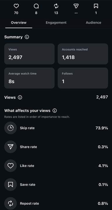
insight statistics
For the first video of the FLIP campaign, the idea was to get the audience to stop from scrolling away and grab their attention with a video of the Arctic which then would tell the viewer to "flip" their phone.
After doing that I made a very fast jump-cut to a video of me performing Flip upside down which was the way I instructed the audience to flip their phones.
The statistics however, showed that this version didn’t perform well at all. Even though the video got over 2000 views, a lot of people skipped it, that being 73.9% of the people to be exact, and it only brought in 1 new follower which is not a great start but something we can base the work around. But although it did get seen, it didn’t actually hold attention or convert to anything.
Although it failed, it taught me something quite important and that is that the target audience I have picked could immediately tell when something feels forced or unnatural, and that is not something that they are into seeing and supporting. They engaged a lot more with content that felt natural and had real visual style.
This first video and it's statistics helped me better understand the audience and guided me when creating the second video.
A/B Test 2 - Macbook camera edit

After the failure of the clickbait hook video, this second video was changed to test the algorithm more in depth. I utilized very accessible and outdated hardware (a 2019 Macbook camera) and A/B tested different strategies, including new hashtags and more optimized descriptions.
The analytics of the video showed partial success which therefore explained that the changes made have successfully pushed the content to a wider audience, increasing the views to 3300 and reaching over 1700 accounts.
However from the statistics I have also realized that the engagement stayed pretty much the same. The skip rate was still quite high, it being at 73.4% and the video only converted 1 new follower once again.
This gave me a very important information that I needed to remember for this campaign, which was that the description and hashtag change was extremely effective for algorithmic reach, high quality production is most definitely needed to retain viewers and convert them into followers.
A/B Test 3 - Gallery shoot
tiktok analytics

instagram statistics


To further test algorithmic distribution, I cross-posted this version to TikTok.
The stats show a big difference in engagement. While on Instagram the video got pushed to over 3000 viewers, the exact same video on TikTok stopped at 477 views. However, the average watch time remained the same on both platforms.
On TikTok, the average watch time was just 8 seconds, with a quick stop, resulting in only 3.15% of viewers fully watching the video and only gaining 1 new follower.
This cross-platform posting showcased a major campaign find. While both platforms use different algorithms to distribute content, they do it at different volumes and poor visual identity and quality fails to turn scrollers into followers, regardless of the platforms they are being posted on.
A/B Test 4 - Couch shot


Learning from the first 2 videos created and posted this third version I prioritized visual quality. As a Creative Director, I collaborated with a dedicated cameraman (Robert) and using his professional Lumix camera we have shot a few different clips for a couple short form videos such as this one.
With his help I have adjusted some lamps found in the room and created a cinematic split light setup using a red lamp and a faint yellow light lamp to then create very dark shadows to add to the "aura farming" and dark aesthetic, before personally doing the post-production.
In post I have used Premiere Pro to edit the clips together and color grade them and then used Instagram Edits app to add animated captions, to enhance reach for the client as this would then include users who scroll on the platform without sound being on.
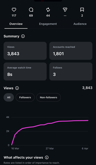
The insights proved my idea to do these changes was great as it increaed engagement by quite a lot with views peaking at a campaign high of 3843.
Additionally the use of captions successfully captured a lot of the users' attention within the first 3 seconds, lowering the skip rate to a campaign low of 70.6%.
These changes increased viewer retention and directly impacted the bottom of the funnel, resulting in an increase in new followers (3 new followers) compared to previous 1 new follower per video. This showed me that combining the high quality production with the animated captions is the most effective conversion formula for this specific demographic.
A/B Test 5 - Elevator shot


Moving into the pre-release part of the campaign, I specifically used the previous newly discovered combination of high quality dark aesthetic filming and animated captions to maximize viewer retention.
I directed the cameraman to film in a different type of environment (a lift). Due to these production choices, I knew the video will maintain its dark "aura" aestethic and adding the animated captions again using the Instagram Edits app to keep viewers locked into watching the video.
The results confirmed that I was succesful in optimizing the main retention issue by slow trial and error progression. This video reached an all time low skip rate of 70%, therefore also increasing the average watch time to 9 seconds.
The algorithms push remained very effective, with the video hitting 3363 views and reaching nearly 2000 accounts, with a comment rate of 3.7% and a strong share rate of 1.2%. This data proves that through trial and error and experimentation with different mediums such as different camera qualities, different lighting setups and different edits, the combination of high quality camera with good lighting and color grading and on screen captions is the best combo to gain the most amount of views and retention. This was exactly something I was looking for mostly as the release date for the song was just around the corner.
Final Content Production phase:
Call to action, audience checking and cover art creating
To finish up with the short form content rollout, I posted two distinct videos specifically to push the audience to the final stage of the conversion funnel.
The first was a raw, behind the scenes video filmed on the music video set (inside of the film studio), with the client performing to a song by Lucki. This was specifically chosen to be posted as Lucki was part of the artists the target audience listened to which was mentioned in the Phase 1 audience research. The video is used to help the audience relate to the artist as, in the same way they listen to Lucki in their free time, so does the client/artist. Relatability creates a more comfortable feeling for people which makes them more likely to support the client and engage more with him.
The final post is an edited version of the intro of the final music video, with "MUSIC VIDEO ALERT" written both below and above making it unescapable and letting viewers know the release date is soon, with the official release date being announced at the end.
This finally changed the campaign from the snippet short form content creation that is made to grab attention, retain and gain viewership through different visuals to a call to action.
The main goal of this final Reel was to funnel the audience who got used to the previous weeks of A/B testing and direct them toward the Spotify platform and the final YouTube premiere for the music video.
Cover art creation:

One of, if not the most important part of the final song release was creating the cover art. Since this is the main visual that users see on Spotify and Apple Music, it had to be fitting perfectly with the gritty aesthetic we already reached in the short form videos.
I took the images for the cover from different photos taken during the video shoots and specific frames in the videos taken.
I then put them into Adobe Photoshop to edit them.
I started by erasing the backgrounds and collage the images together, individually turning the images in black and white and adding image specific treshold settings so each photo has exactly the amount of detail i want to show or not. I then used parts of pictures and created custom textures as seen in the top left of the cover art.
The dilemma:
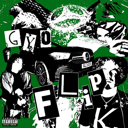
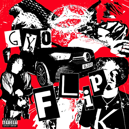
As you can see from my experiments, it was a hard decision to make on which version to use for the official release as I created three main iterations , those being a red version, a green version, and a black and white version.
While the colored experiments looked intriguing, they felt slightly out of place and I decided to go with the final black and white version.
It felt much more raw and authentic to the song's sound. It was just plain and simple but with so much going on you do not know where to look first.